New Floating Windows - Noteey 1.17.0
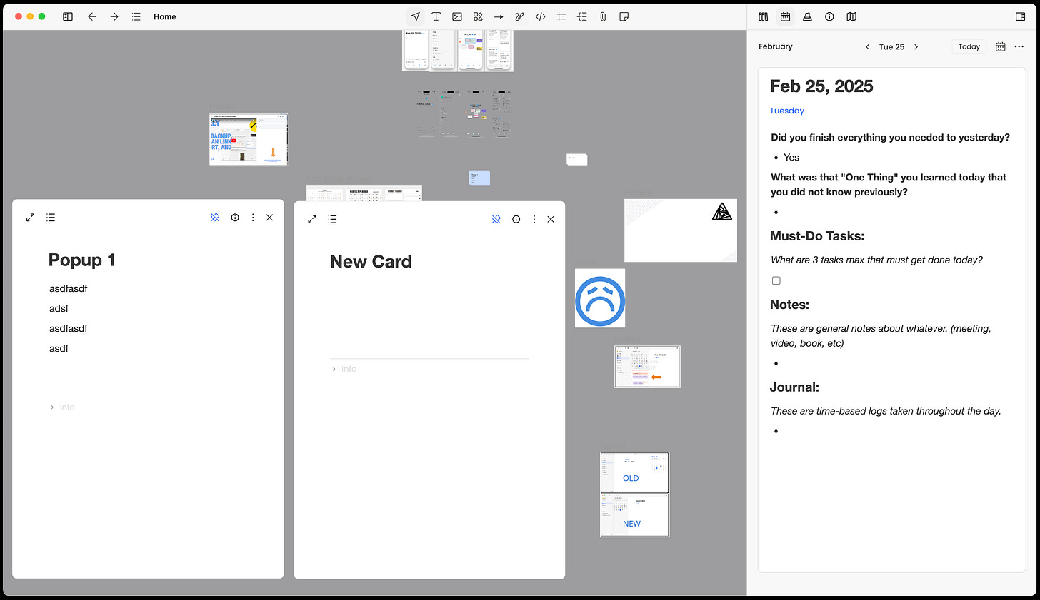
In this video and post I walk through and provide feedback on the new floating windows feature, no tag feature, Journal user experience changes and boards in the right side pane.
New Features and Improvements:
Board viewer in side panel: Now supports opening two boards simultaneously in split view
Floating Window: Support for opening multiple documents and media files simultaneously
Journal Feature Enhancement: Added calendar sidebar for easy date navigation
Added ability to filter and display all untagged cards
My Thoughts:
After using this version of the application I find that things work well overall. The new features are great and I have not found any issues with how they work and they're intuitive.
One that I'm not too sure about and that's the Journal update. The UI has changed a lot from the previous version. The top list of dates are now completely gone. This is not a great loss but it was useful. I wonder if this is something that wasn't easily replicated in the web app so it was removed.
Now, clicking on the calendar icon opens a side pane left of the Journal. I'm not too sure about this approach because it takes up a lot of vertical space in the app versus the previous quick-view pop out calendar that disappeared once you selected a date.
I find it interesting that the calendar is now in a side pane and wonder if this is sign that syncing with a service like Google calendar is being considered. That's the only reason I can see for this particular change. Below is an unofficial mockup of what calendar sync could look like in Noteey if it was added to the application.
Floating “pinned” windows are a great addition to Noteey and lets you work on multiple cards without having to move their position on the board or use the side pane. They’re currently free floating with no ability to snap or minimize
With that said, I'd love it more if the popup windows where more pop-out windows that could stand on their own and positioned outside of the main Noteey app window. Currently they stay on top of all elements like left and right side panes and the main visible board in the Noteey application.
I’ve still only had limited time with these new features so I’m sure I’ll find ways to fit them into one or more workflows and my everyday use of Noteey.
Noteey is still fairly new but has been pushing out features and bug fixes at a break neck pace. And so far I’m loving it. The web and mobile applications are still in the development and are scheduled to be release in Q1/Q2 timeframe.
I’d appreciate if you use my affiliate link if you plan to purchase Noteey.
Random Findings:
One thing I found is that the icon for external links changed from a square to a globe.


